This final project has not only challenged my thinking and organization skills, but also expanded my design experience. Now that I look back at the design process for this bench and shelter, it’s amazing to see the transformation from an old water spigot to a model bench and shelter. The most challenging part of the design process was taking my 2D abstract drawings and turning them into 3D models. It was hard to not simply create what I saw. My favorite part of the design process was drawing the 50 abstract designs. It allowed me to be creative and come up with designs from just one line on my spigot. I’m still amazed to see how an abstract design turned into a functional bench. I will definitely be applying some of these steps later in my studies and career.
Thursday, July 28, 2011
Found Object

Technical Poster

Aesthetics Poster

Tuesday, July 26, 2011
Process Poster

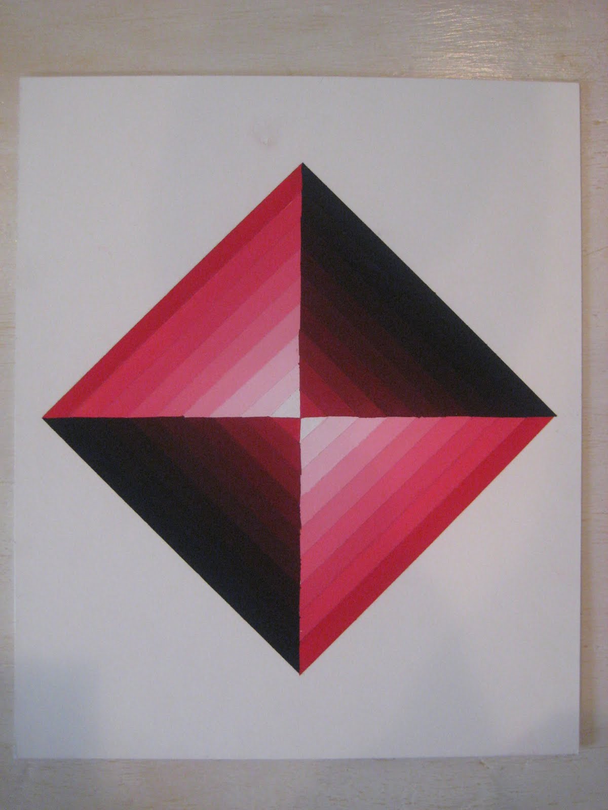
Simply Lines

Final Concept Model

Room Study

Up-Side Down Drawing

Mind Map

Wednesday, July 20, 2011
Concept Model

Thursday, July 14, 2011
Chair Styles

Classy Marina

Positive and Negative Space

High Key and Low Key


This assignment was to show high key and low key contrast. Simply put, the left is as if the lights were on and the right is as if the lights were turned off or a shade pulled down. I used a combination of the three primary colors with the addition of the secondary color green. In the High Key piece, I tried to keep the colors as close to their "tube" pigment as possible, with the addition of some red to the yellow and white to the blue to create perspective depth. For the Low Key piece, I took those same colors and added black to mute their intensity. This piece was created in my Color Design (ART 111) class at Bellevue College.
Color Schemes

Monday, July 11, 2011
Renaissance Textile

Monday, July 4, 2011
Elements and Principles of Design


These are posters demonstrating the elements and principles of design. I was assigned the Renaissance time period and had to find images accordingly. Luckily I am pretty familiar with this era so it wasn't too hard to find images. I used sever different types of examples from buildings, to chairs, to paintings, to plates, to vases. The posters were created in Adobe InDesign.
Friday, July 1, 2011
Tints and Shades
Color Wheel

Pattern Block

The point of this project was to create a composition based on a geometric pattern block in Adobe Photoshop. First I chose to create an analogous color scheme, and I chose a pattern. I then chose six images I felt fit into this color scheme paying attention to color, value, texture, and luminance. I began manipulating the images by adjusting adding filters, effects, and distortions. Once all my images were manipulated, I began placing them onto my pattern. I further manipulated them by stretching, distorting, or scaling the image to fit part of the geometric pattern. I heavily used layers so I could later adjust the size and placement of my images. It’s hard to tell what my original images are. The center diamond is a green parrot distorted with the liquefy tool. The triangles surrounding the corners of the parrot are green orchids distorted to create a triangle and with the spatter filter. The yellow diamonds with the black in the corner are a yellow butterfly distorted with the liquefy tool. The green and yellow triangles between the orchid triangles are a yellow and green parakeet distorted to create a triangle and with the dry brush filter. The four, large, green triangles are a tree frog distorted to create the shape and with the dry brush filter. Finally, the light yellow triangles around the boarder is a yellow tang fish distorted with the liquefy tool and to fit the shape.
Palouse Horse


This image was created in Adobe Illustrator along with a Wacom tablet. I found a picture of some hills and a horse in the Palouse, Washington area. Using the Wacom tablet, I used the paintbrush tool to draw on a layer over the original image. Once I finished my drawing, I turned off the background layer (original image: bottom) and this (top) is what was left.
Subscribe to:
Posts (Atom)